The Evolution of Buick’s Logo (PDF)

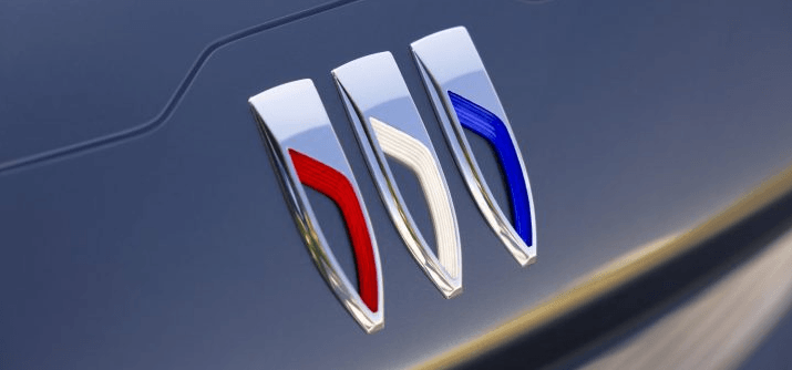
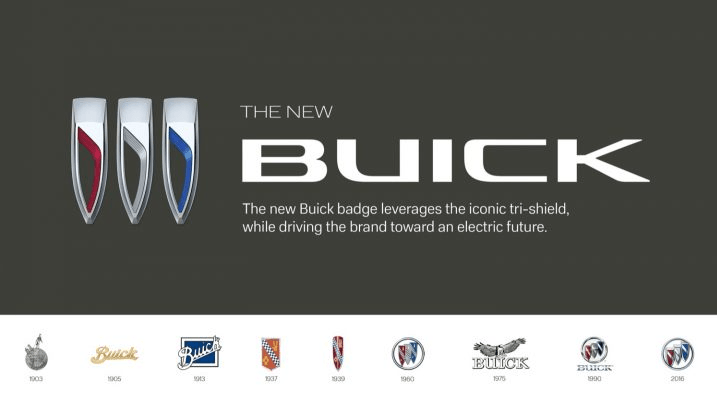
We’ve known Buick for over 60 years, but the brand logo has changed as Buick transitions to an all-electric brand. As opposed to the tricolor shield with the silver ring and horizontal line, the new logo features red, silver, and blue vertical shields with angled lines running through them instead.
General Motors president Mark Reuss was shown some vehicle designs with slash marks where a logo would normally be several years ago, as part of redesigning the brand as an EV-exclusive brand.
“This one just slipped through without a badge, and when he saw it, he was intrigued. I think that started the whole conversation,” said Geoffrey Richmond, one of Buick’s senior executive designers.
Therefore, included in the concept art of the 2024 Encore GX, the new logo was born. The silver ring has been removed, and an angled line passes through the shields instead of the tricolor shield surrounded by a silver ring with a horizontal slash through it. While maintaining a sense of history and brand recognition, this design is classy and modern.

Reuss said: “The redesigned columns of the tri-shield incorporate fluid movements that convey motion,” “It’s sleek and dynamic, and I love that we’ll see it on all Buicks going forward into the new era of electrification for the brand and for the company.”
This new design is exciting to Steve McCabe, Buick’s advanced design manager. In addition to appearing on vehicles, logos are prominent on business cards, the automaker’s website, coffee mugs, and dealership signage as well. With the change, higher-ups are confident that the brand will continue to be recognized, but may draw in a new crowd.
It was first designed in 1959 to symbolize Buick’s three models, the LeSabre, the Invicta, and the Electra. The shields kept the brand recognizable to customers and business partners even though those models aren’t part of the lineup anymore (minus the aptly named Electra).


